- Dashboard Tabs
- Dashboard Items
- Types of Dashboard Items
- Create a Dashboard Item
- Examples
- Example 1 – Database Server Requirements – latest updates table
- Example 2 – Test Distribution Table by Author and Status
- Example 3 – Regression test statuses pie chart
- Example 4 – Pie chart to review test sets by “Assign To” value
- Example 5 – Execution Progress to review instances progress
- Example 6 – Planned vs. Executed graph to track actual instances execution
- Example 7 – Creating instance-based items with Test, Test Set or Run level fields
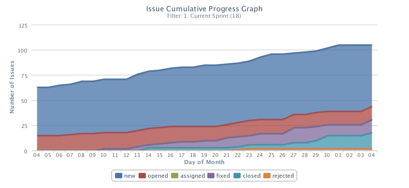
- Example 8 – Issue status changes graph to review issues by status
- Example 9 – Issue Status Aggregated Progress graph to review issue resolution
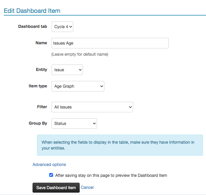
- Example 10 – Age graph for issue management prioritization
- Example 11 - Exploratory test status
- Example 12 - Gauge graph to review percentage of passed tests
- Customizing Chart Colors
- Changing the Location of a Chart’s Legend
- Reordering
- Embed Dashboard Items
- Embed Dashboard Tab - External Dashboard
The PractiTest dashboard provides a detailed overview of your projects. View real-time data showing the portion of your planned tests that were executed, how many tests passed, how many open issues are waiting to be solved, and more. The dashboard enables you to manage not only your data, but your entire team. See how the workload is distributed, identify bottlenecks, and so on.
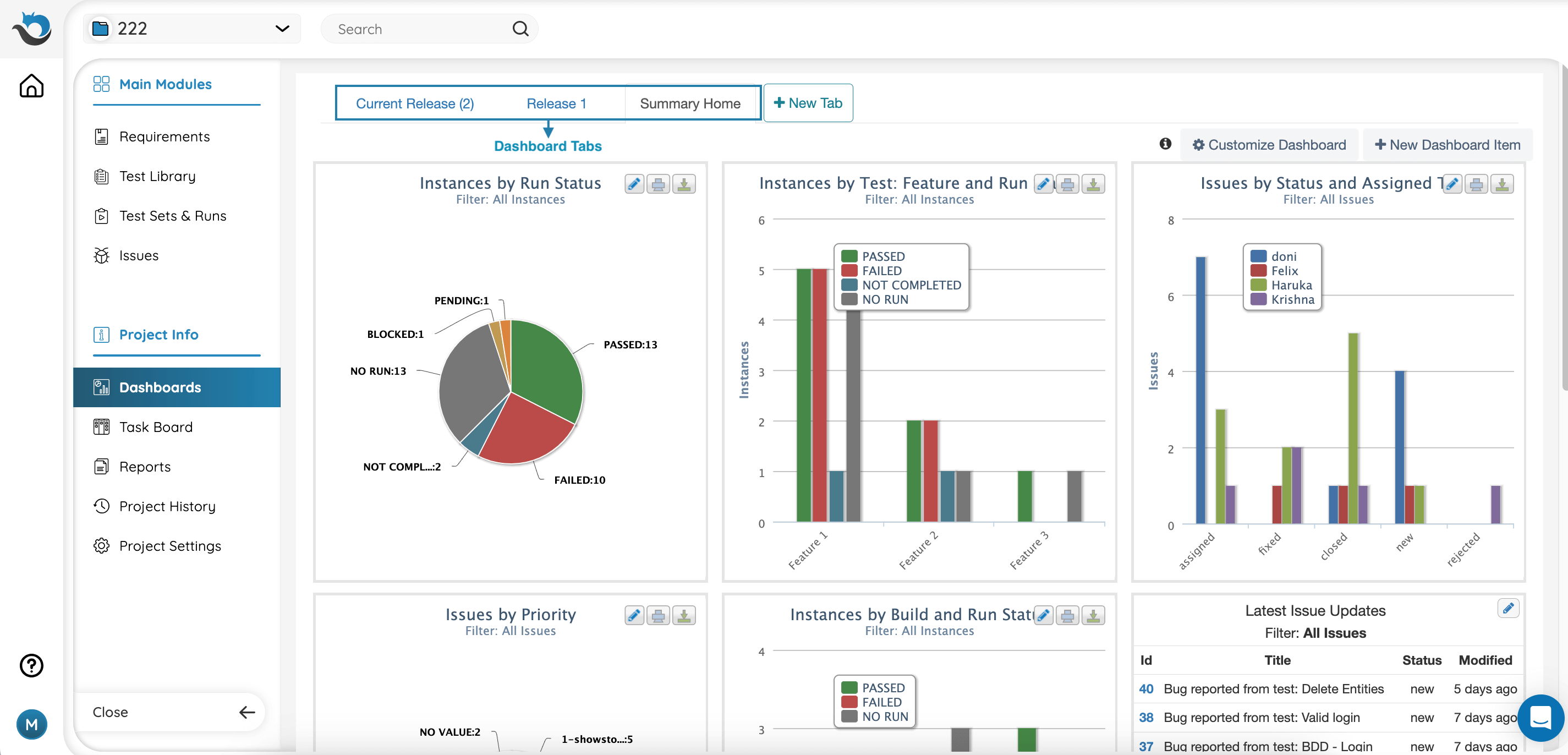
Dashboard Tabs
Choose the information to display on your dashboard and organize it under different tabs. This helps you stay informed about what interests you the most.
Create an unlimited number of tabs. They can be set to either public or private access. Each tab can hold up to eight separate dashboard items. To add a tab, click on the ‘New Tab’ button next to your existing tabs, or access the ‘Dashboard’ section from settings and add the tab from there.
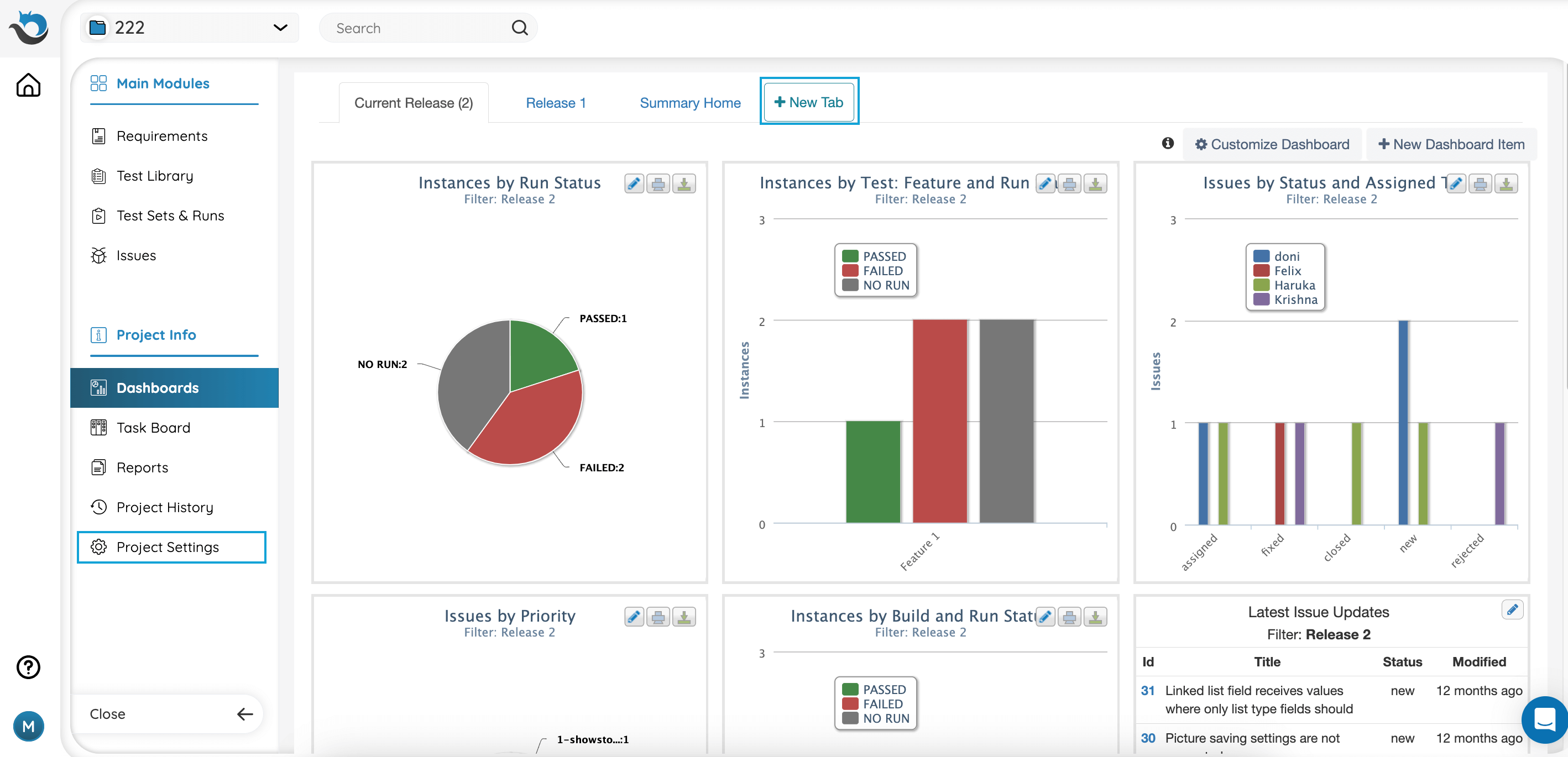
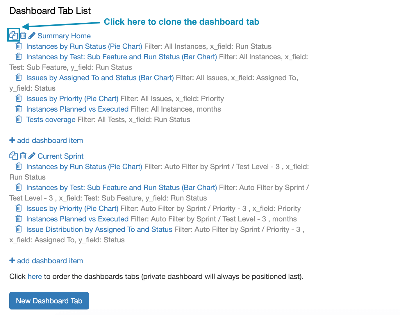
Cloning Dashboard Tabs
You can reuse dashboard tabs within the same PractiTest project they are created in. For example, let’s say you start testing a new product version. Rather than creating a new dashboard tab from scratch, you can reuse the old one by making a few small changes. Simply clone your dashboard tab using the cloning functionality.
To get started, click the ‘Customize Dashboard’ button at the top right-hand side of the dashboard, or go to Project Settings > Dashboard Tab.
Dashboard Items
There are a variety of options to display information on dashboards.
You can use custom filters to filter the information displayed on your dashboard items.
Clicking the dashboard graphs allows you to zoom in and see the relevant data. For example, if you have a pie chart of issues by status, clicking on the ‘Open’ portion will take you to the list of issues in ‘Open’ status.
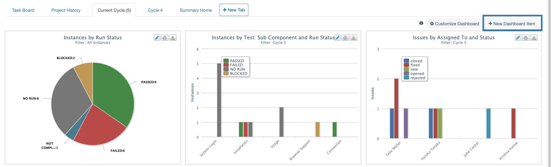
To add a new dashboard item in a tab, access the relevant dashboard tab, then click the ‘+ New Dashboard Item’ button on the top right-hand side of the screen.
Types of Dashboard Items
There are 8 different types of dashboard items:
- Latest updates table
- Distribution table
- Pie chart (Instances have a Step Status pie option)
- Bar chart
- Progress graph
- Execution progress (for Tests and Instances)
- Defect age (for Issues)
- Planned vs. Executed (for Instances)
- Gauge
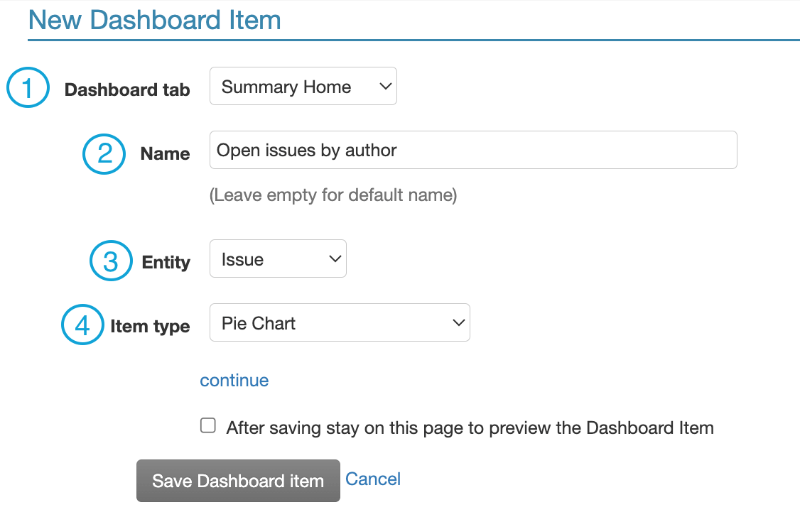
Create a Dashboard Item
To create a dashboard item, click on the “Add Dashboard Item” link. This will open the “new dashboard item” window.
-
Choose the Dashboard tab where the new item will be added.
-
Select a name for your dashboard item. If this field is left blank, the default name will be used.
-
Choose an entity: Issue, Test, Test Set, Test Instance, Requirement or Run.
-
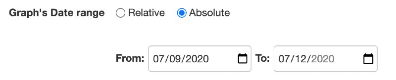
Choose the Dashboard item type from the dropdown menu. When choosing Issue Status Changes or Instance Planned vs. Executed, you will see two options for time range: relative or absolute. When selecting relative, the dates will automatically change over time. When selecting absolute, the dates are predefined for a specific time period and do not change.
-
Click “continue”. This will open additional criteria according to the entity and item type selected.
- Filter criteria: includes data from a specific filter. To include all data in the entity module chosen, select the ‘All Entities’ filter.
- Field criteria: presents the data based on a specific field.
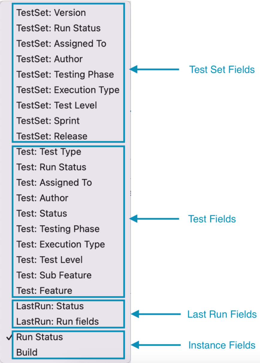
Note: for instance-based graphs, you will be able to present data based on fields from test sets, tests and last run. Meaning, the data that will be presented is the instance data, but you can base it on related fields from different entities.
To base your dashboard graph on a specific Test Set, follow the instructions here.
Examples
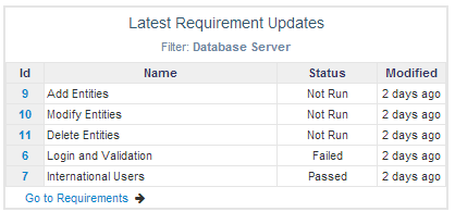
Example 1 – Database Server Requirements – latest updates table
This specific example uses the “Database Server” filter. You can create a dashboard item based on any filter you’ve created in the system.
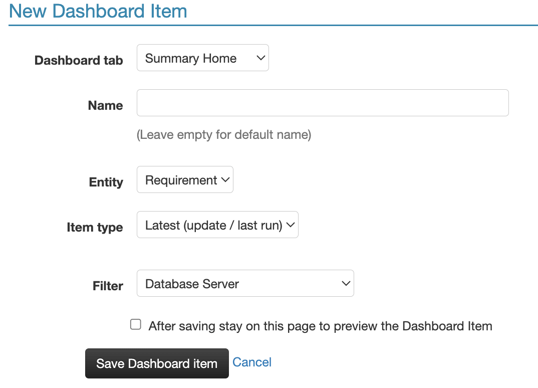
The following chart will be added to your dashboard, showing the latest database-related requirements and their statuses.
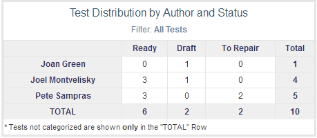
Example 2 – Test Distribution Table by Author and Status
The table below shows how many tests are ready to execute, how many drafts, and so on. You can also view the test’s author.
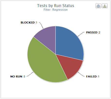
Example 3 – Regression test statuses pie chart
The pie chart below is based on the Regression tests filter.
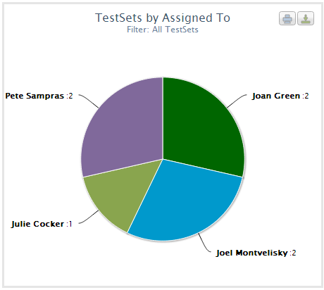
Example 4 – Pie chart to review test sets by “Assign To” value
The pie chart below shows how many test sets are assigned to each tester. Clicking on the chart sections will automatically display the entities they represent.
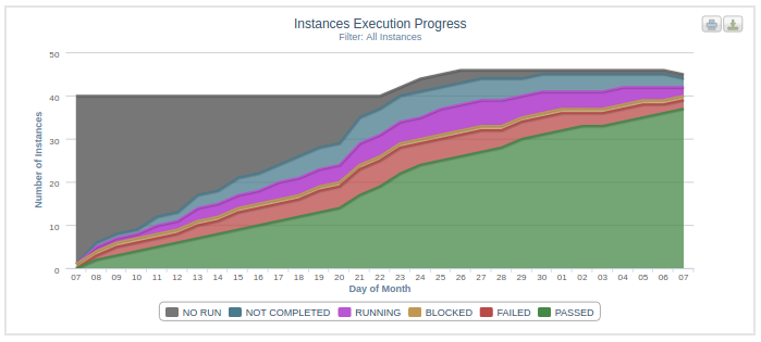
Example 5 – Execution Progress to review instances progress
The Execution Progress below shows the progress of all instances where X field shows the day of the month and Y field shows the number of instances.
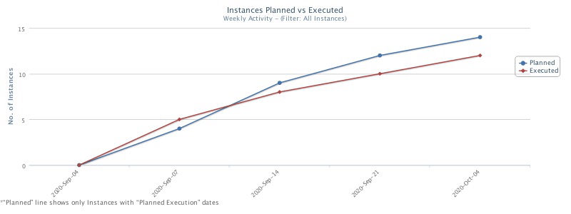
Example 6 – Planned vs. Executed graph to track actual instances execution
The Planned vs. Executed graph below shows the execution progress of all instances in the selected scope compared to the planned execution date. This information is taken from the ‘Execution Date’ field at the Test Set level.
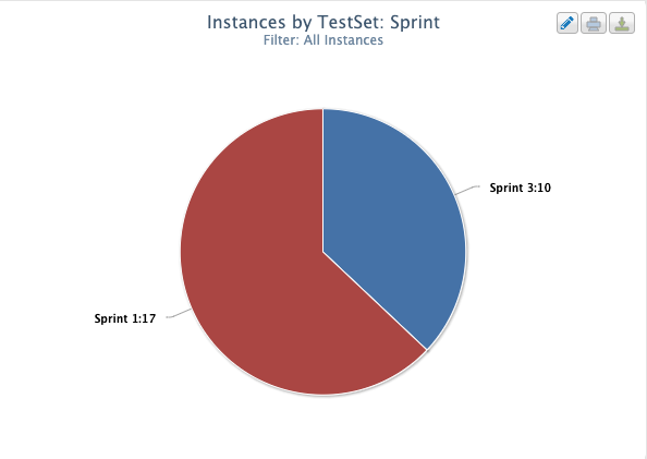
Example 7 – Creating instance-based items with Test, Test Set or Run level fields
When creating a test instance-based dashboard item, you can choose to use Test, Test Set, and Run level fields in addition to fields from the Instance level. For example, if you have a ‘Sprint’ custom field enabled for the Test Set level and you want to create a chart that would present Test Instances by Sprint, select ‘TestSet: Sprint’ as the X field of the chart.
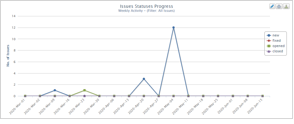
Example 8 – Issue status changes graph to review issues by status
Issue status changes graphs allow you to review the number of issues assigned with any status included in the graph, in a selected period of time. In the following example, the number of issues by status are shown from March 1st to June 15th.
Example 9 – Issue Status Aggregated Progress graph to review issue resolution
Issue Status Aggregated Progress graphs allow you to review the progression of Issues resolutions in your project over a particular period of time.
Example 10 – Age graph for issue management prioritization
When creating an ‘Age graph’ dashboard item type, you can select to apply it to ‘All issues’ or choose from existing filters in the Issues module. Then choose how to group the information based on the entity’s fields.
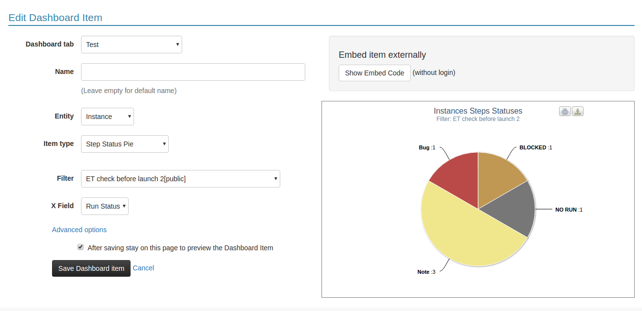
Example 11 - Exploratory test status
When creating a dashboard item to present test status (annotations) for exploratory tests, Select Entity> Instances, and Item type> Step Status Pie. This will display the exploratory test steps (annotations) and their status. It includes all status results in a single pie chart for any manual, automated, and exploratory tests.
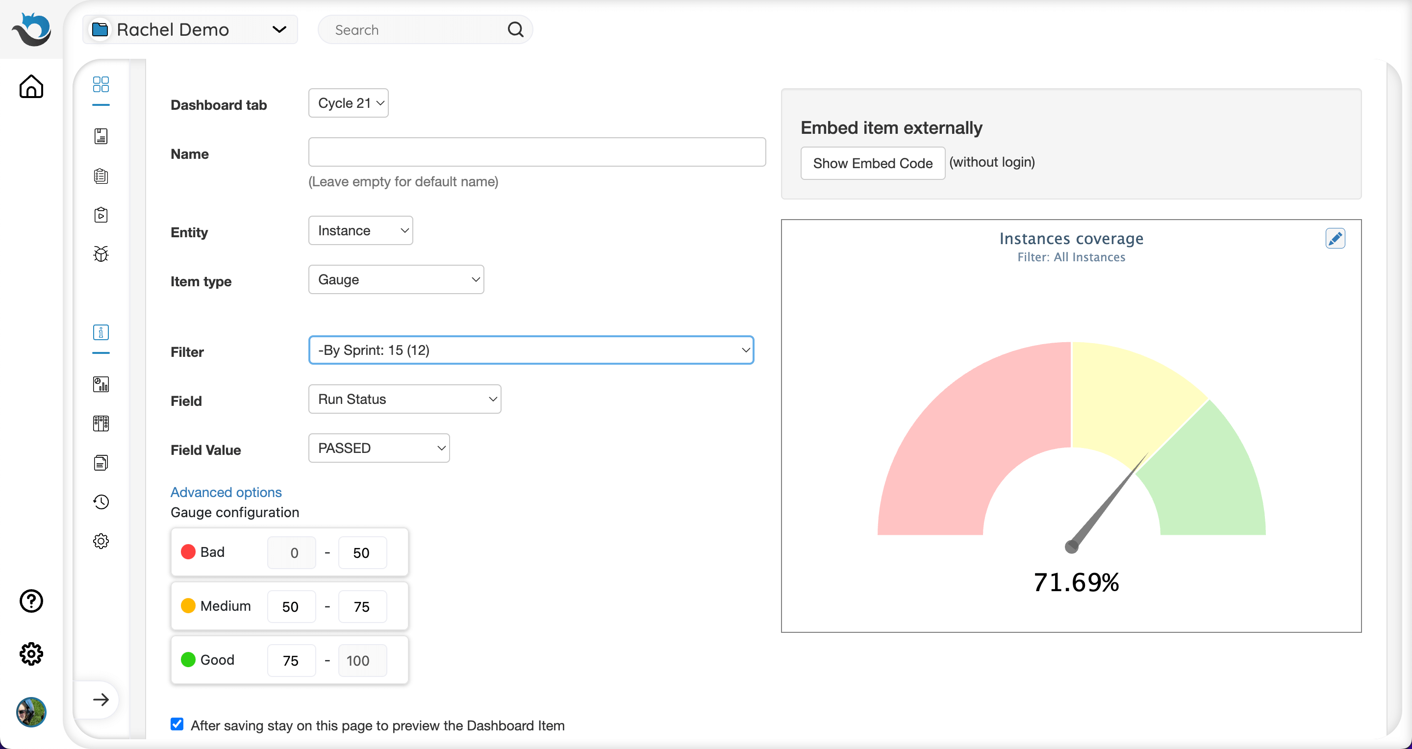
Example 12 - Gauge graph to review percentage of passed tests against KPIs
The Gauge graph allows you to define KPIs for a certain parameter, display a value of this parameter in a quantitative way, and track its performance against the KPI. Let’s say we want to check whether the percentage of passed instances in this sprint is reaching the goal of 75%. First we will select Entity> Instances, and Item type> Gauge. In this example we will choose to filter the data based on the current sprint. Next we will choose Field> Run Status and Field Value> Passed. Now the graph will show us the percentage of instances in this sprint that their Instance Run Status field is marked as Passed (defined according to last run). Next, we want to define our KPI parameters Red-Bad, Yellow-Medium and Green-Good. Press ‘Advanced Options’ and define your range. For this graph we will choose to set 0%-50% - Red, 50%-75% - Yellow, 75%-100% Green. Now we can see that in this example 71.69% of our test instances are passing which puts us on the Yellow-Medium state.
Customizing Chart Colors
Customizing graph colors can make it easier to visualize data. For example, you can define a specific color for a user or a project.
To change the colors in a pie chart, follow these steps:
Step 1 – When editing or creating a new pie chart, click the “Advanced Options” link.
Step 2 – Type the selected RGB codes for your pie chart in the “Colors” field. To choose from the colors palette, click here.
Make sure you define the colors in the correct format as indicated in the settings. The RGB codes must be in the following format: ‘#RRGGBB’, with an apostrophe at the beginning and end, and the number sign (#) before the 6-digit code. For example, to edit the pie chart “test set by assigned to” and assign the user Joan Green with the color 006600, type in the color field: Joan Green: ‘#006600’
To add additional colors, separate the values with a comma. For example: Joan Green: ‘#006600’, Joel Montvelisky: ‘#0099CC’
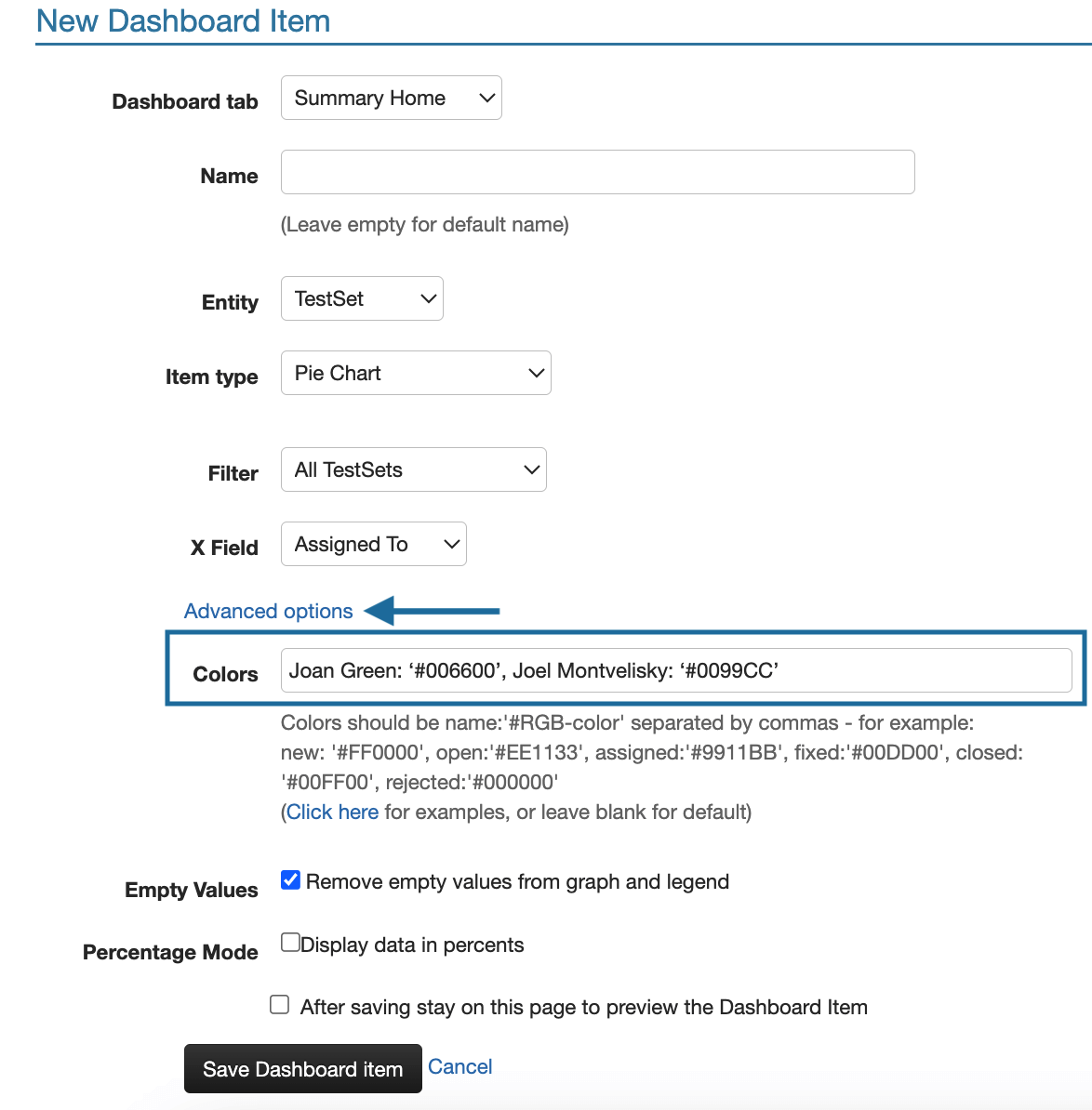
Note: the “Empty values” checkbox is automatically checked to ensure the colors you defined do not shift because of changes in your data.
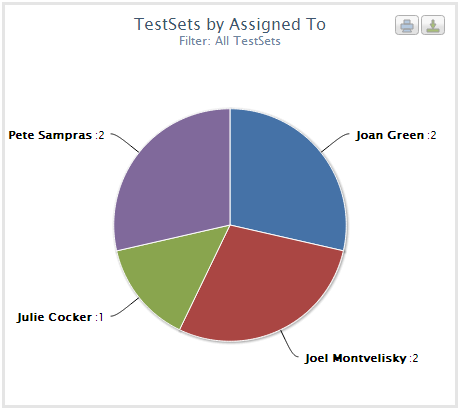
The image below shows the customized pie chart
Changing the Location of a Chart’s Legend
Changing the location of the legend is available in bar charts and progress graphs. It may be useful in case the specific shape of the chart is hidden by the legend.
There are 3 options for the legend location:
- In graph
- Bottom
- No legend
To change a bar chart legend location, follow these steps:
Step 1 – When editing or creating a new bar chart, click the “Advanced Options” link.
Step 2 – Select the desired option from the “Legend Location” dropdown list. You can use the preview checkbox to see a preview of the bar and modify the legend location if necessary.
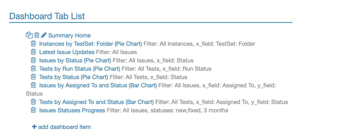
Reordering
You can reorder items within each dashboard or the dashboards themselves. Click the ‘Customize Dashboard’ button at the top right-hand side of the dashboard, or go to Project Settings > Dashboard tab:
Embed Dashboard Items
Easily embed your PractiTest dashboard items into any web portal or company Wiki page, including Confluence (Jira).
In the main dashboard tab, choose Customize Dashboard, enter a dashboard item, and then the embed option appears.
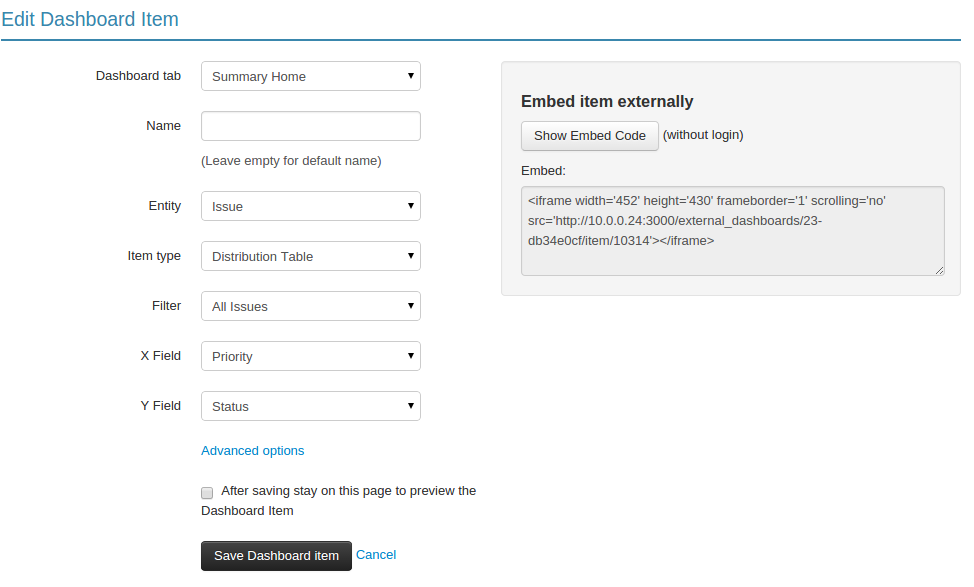
Copy the embed script and paste it into your destination page.
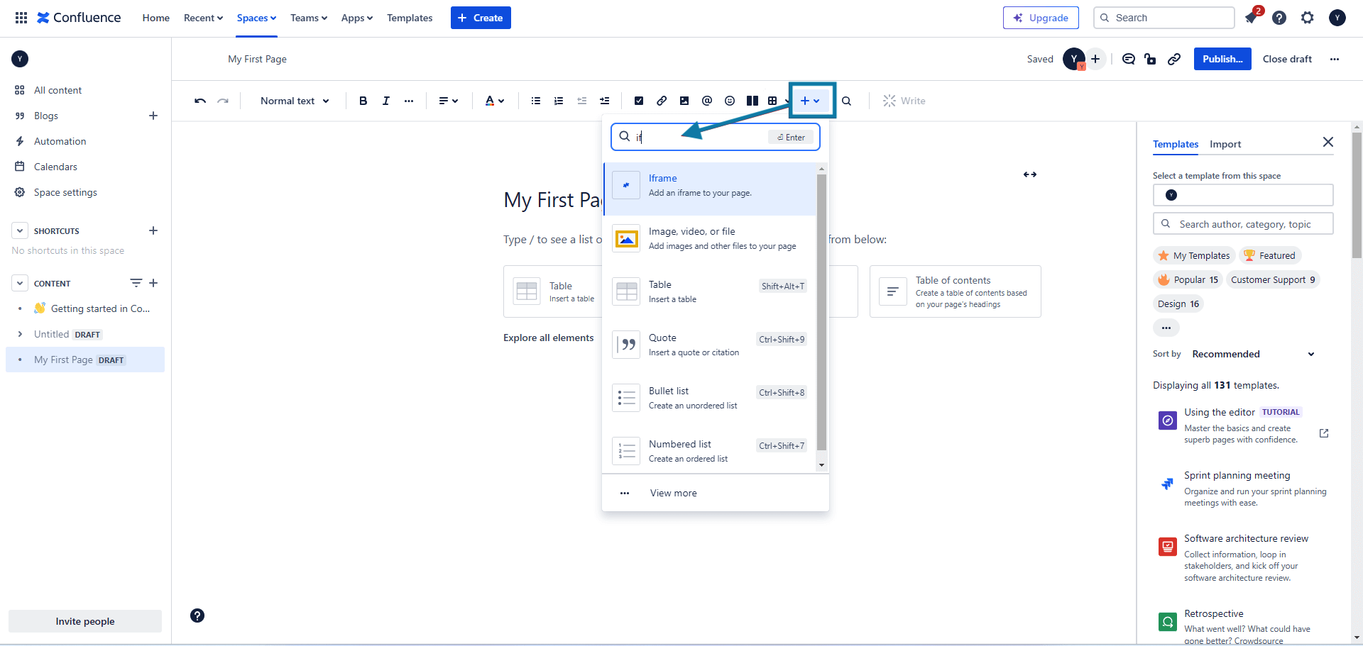
In order to embed the dashboard item to Confluence, copy the embed script, go to the Confluence page where you want to see this dashboard item, press ‘+’ and choose ‘Iframe’.
Then, paste the URL of the dashboard item and add the width and height of the item.
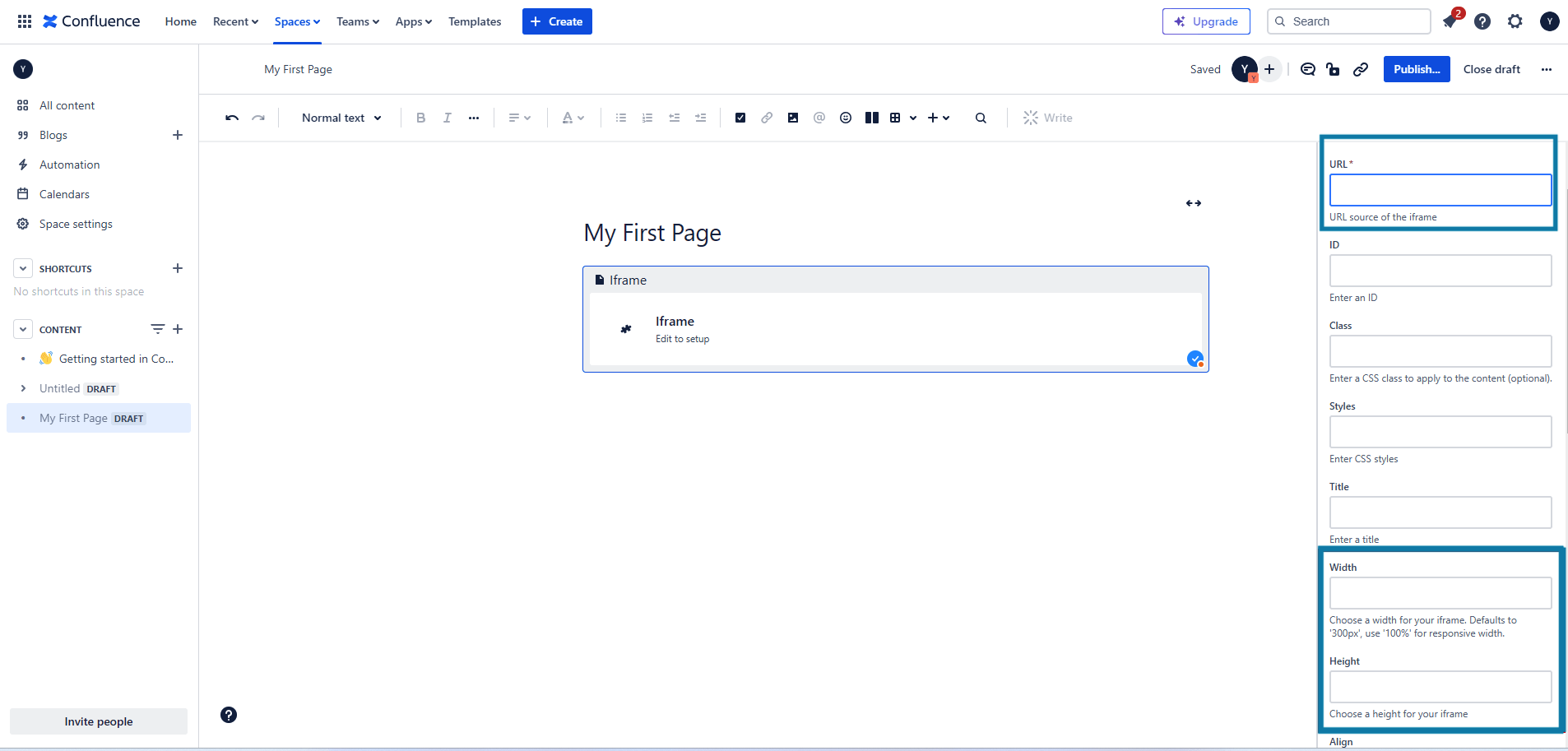
Click ‘Insert’ and the dashboard item will be embedded in your Confluence page.
Embed Dashboard Tab - External Dashboard
Two of the biggest challenges of managing your testing is how to share the outcomes with others, and how to communicate important information resulting from your and your team’s combined efforts.
PractiTest’s dashboard allows you to easily share this information with all stakeholders in your organization.
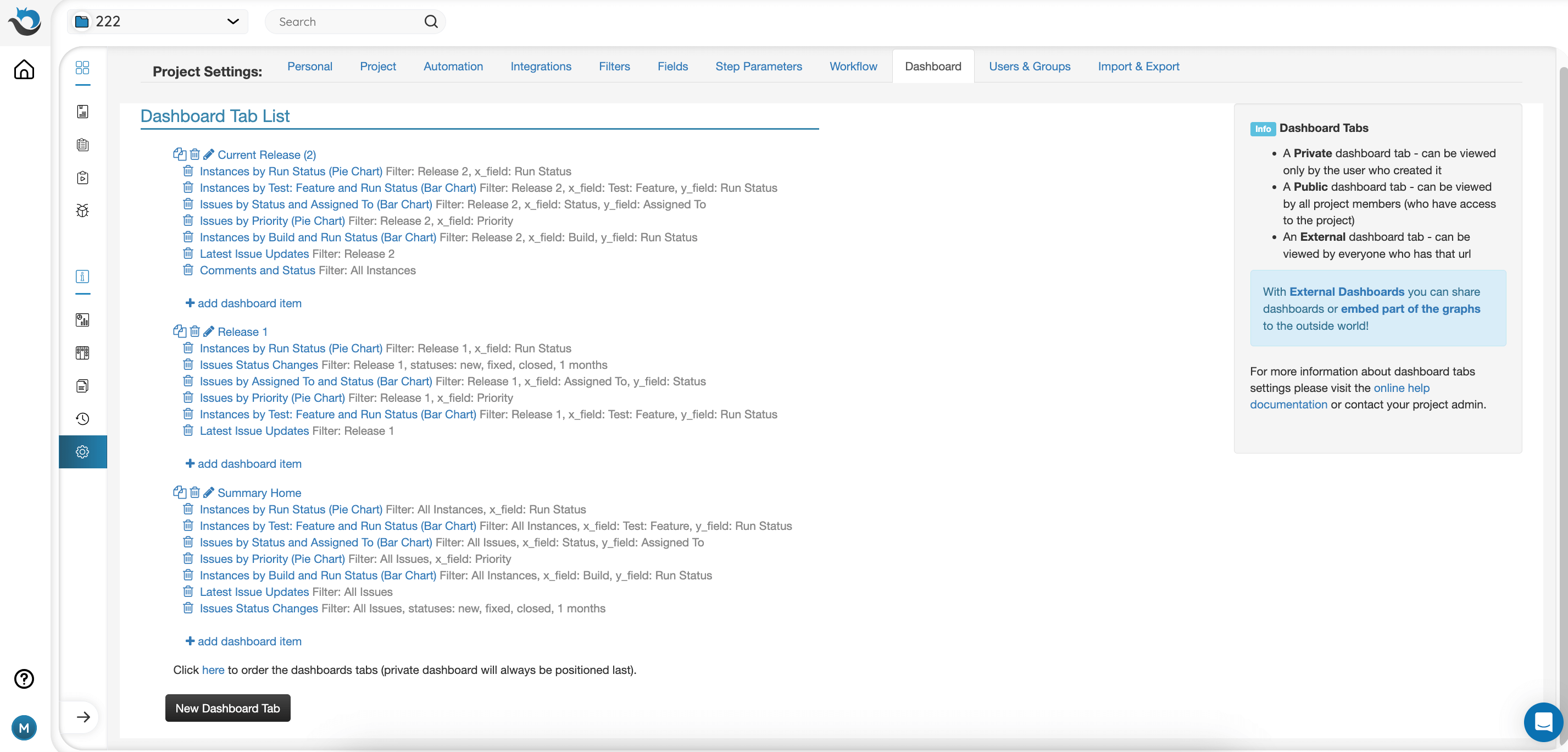
The dashboard is customized via project settings. In dashboard settings, you can choose whether each of your dashboard tabs is internal or external access. External means that even non-PractiTest users can view and access the dashboard.
Configure External Dashboard
Select the ‘pencil’ icon next to the Dashboard tab name. Then, tick the ‘Enable External URL Support’ box and click ‘Save Changes’.
Use the URL shown in the box below to access and share your external dashboard:
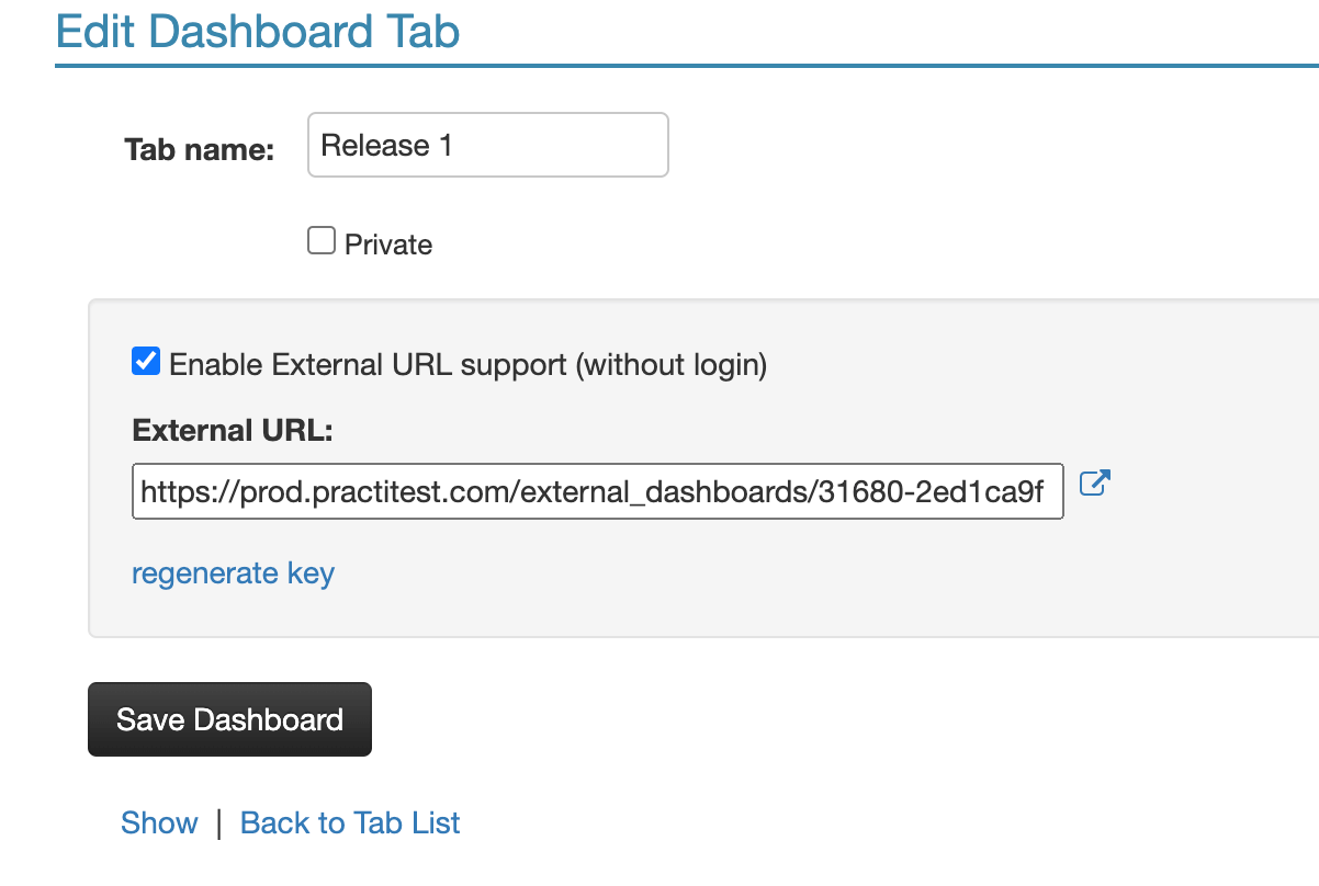
In this example, https://prod.practitest.com/external_dashboards/20-48f33055 is the external dashboard URL.
The dashboard generated by this URL is similar to a regular dashboard, but without links to other parts of the system.
Auto-Refresh
For added value and convenience, your dashboard can be used as a “kitchen monitor”. At the bottom of the external page, click on the link to auto-refresh every 5 minutes:
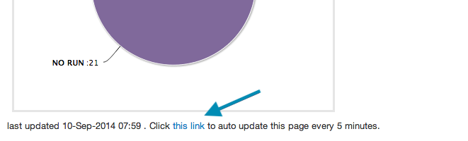
This will display the most up-to-date data in near real time.